Tag Archive for: interior design

Vertical Medical City Biscayne_pontehealth-e1623794482396

While much has been made about COVID-19’s impact on everything from office to retail and hotels, there’s one property type that’s keenly feeling its effect: the health care sector.

Hospitals and medical facilities have fundamentally changed their operations since the pandemic ripped across the nation in early 2020. Sanitization and social-distancing needs became paramount; telemedicine went from fringe to mainstream; and the care of aging patients, especially in areas like Florida with large populations of senior citizens, came front and center. That’s shifting the design of new health care facilities, including projects like Miami’s Vertical Medical City Biscayne, which are trending towards mixed-use complexes that fuse health care with accessibility.

Developers are experimenting with models where patients don’t have to leave their neighborhoods to get the care they need. The trend is driven by the demand among South Florida’s many baby-boomer residents for community-based wellness centers that incorporate apartments, condos, medical-grade pharmacies and advanced medical services on the same campus.

Some developers are acquiring vacant 50,000- to 60,000-square-foot retail centers for conversion to mixed-use wellness centers.

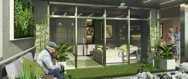
Developer Tabitha Ponte’s Orlando-based company, Ponte Health Properties, is planning a mixed-use, health care city of the future for Miami’s downtown. Vertical Medical City Biscayne, a triple-tower, high-rise complex designed to provide comprehensive health care for people over the age of 60, will combine medical offices, outpatient surgery areas, a life science research component, and a residential component of up to 800 senior-living units that will offer both independent and memory care options. A small on-site hotel would provide short-term recovery from outpatient surgery outside of a hospital setting.

Ponte envisions a network of similar projects across the U.S., starting in Florida. The first project, in Orlando, is about to break ground. And Miami’s Vertical Medical City Biscayne, which was pushed back a bit by the pandemic, will follow next year.

When it comes to new construction, the key is more flexible design options that include adaptive reuse.

Location is also critical. By and large, hospitals and single-purpose properties are giving way to more outpatient centers and ambulatory service centers located within the neighborhoods they serve.

Interior design changes include finishing floors with porcelain or vinyl tiles, rather than carpets and selecting fabrics that don’t absorb moisture. Upgrading air filtration and exhaust systems is critical. The U.S. Environmental Protection Agency recommends that large commercial properties upgrade air filters to the highest efficiency possible that is compatible with the system and check the filter fit to minimize filter air bypass.

Renovations could also include electronic patient screening at the entrance to medical buildings and monitors that guide patients to individual waiting rooms, eliminating the need for person-to-person contact until the patient enters the doctor’s office, as well as touch-free innovations, such as doors that open and shut automatically, and lights that turn themselves on and off.


Source:  Commercial Observer

Many of the issues that the healthcare design industry grapples with such as safety, infection control, and noise mitigation can acutely affect the elderly. But there are certain building design attributes, as listed below, that more profoundly affect us as we age. What lessons from research on environments for the aging have we learned that could be applied to hospital design?
Several resources, including “Code Plus – Physical Design Components for an Elder Friendly Hospital, second edition” (2015) published by Fraser Health Authority in Canada and Nurses Improving Care for Healthsystem Elders (NICHE), an international nursing education and consultation program focused on geriatric care in healthcare organizations, offer ideas on how to improve healthcare practices and environments to serve seniors. Here are a few ideas to consider:
LIGHTING: As we age, one-fifth to one-third less light reaches the retina, reducing visibility. Consistent ambient lighting with less shadows can help seniors distinguish objects and is a vital design feature especially where older patients ambulate. Minimizing glare, especially on flooring surfaces, is also important in reducing falls. For better sleep, light sources in inpatient rooms should be controlled by the bedded patient, allowing seniors to create a dark, calming environment during rest times, day or night.
INTERIOR DESIGN: Colors can appear more muted to seniors, making pastel colors such as blues and greens appear washed out. A better solution is to use color to create a contrast in relation to the floor, for chair seats, and bathroom fixtures to allow elderly patients to perceive edges more clearly. Higher contrast between walls, floors, and ceilings also helps orient the patient. Floor design should be carefully considered since patterns may be perceived as disorientating movement. Specific color choices matter, too. Studies have shown that colors in the red/orange family, such as peach and apricot, are energizing and more easily perceived than colors in the blue family.
CIRCULATION AND WAYFINDING: Shorter travel distances to hospital destinations are even more important to seniors who may lack the mobility or energy to negotiate long hallways. Handrails and strategically placed seating allow for periodic rest stops and should be provided throughout the facility. Signage needs to feature larger lettering for seniors with declining eyesight or visual impairments and should be mocked up and tested with seniors for clarity and simplicity before final installation.

FAMILY SUPPORT: Many seniors are accompanied at the hospital by concerned family members. Private family seating areas (ideally with windows) located throughout the inpatient unit are more useful than a remote family waiting area and allow meetings with caregivers or phone calls to be done while staying close to the patient’s room. These spaces can also serve as areas of respite when family members need a short break.
More than half of hospitalized patients 65 years or older experience delirium, defined as “mental disturbance characterized by confused thinking and disrupted attention usually accompanied by disordered speech and hallucinations,” according to a study by the American Delirium Society, a community of professionals dedicated to fostering research to minimize the impact of delirium on the health and wellbeing of patients. This equals 7 million patients per year.
Some hospitals have opened specialized geriatric “eldercare” acute care units, which are senior-friendly environments focused on safety and management of geriatric syndromes such as delirium. But it seems to me that all adult inpatient units should be senior friendly, with design features and clinical practices tailored to the elderly and their conditions.
Certainly, the attitudes and preferences of tomorrow’s senior population may be very different than the generation we currently serve. Yet the clinical needs will remain constant. As the U.S. population ages, the design of our inpatient facilities will need to accommodate the needs and desires of the elderly more than any other age group.
Source: Healthcare Design

waiting room

In the “old days,” medical and dental waiting offices were usually somewhat functional, but certainly not patient-friendly. The chairs were painful, the working space was non-existent, the lighting was cruel and unusual, and you were lucky to find a magazine from the current decade.
Time has changed! These days, savvy practice leaders understand that making their waiting room a place where patients want to remain — rather than are forced to be — is not just good manners, but it is also a good strategy. Indeed, fostering patient loyalty and generating referrals are essential for a healthy (no pun intended!) bottom-line. A waiting room that is memorable for all of the right reasons vs. the wrong ones supports both of those critical objectives.
With this in mind, here are four best practice for medical and dental waiting room office design that can make a significant, and in some cases dramatic – difference to patient satisfaction rates, roster sizes, and overall practice profitability:

1. Emphasize the “Room” Aspect of Waiting Room

Some waiting rooms are pleasant esthetically and have some nice enhanced features (we will explore some of these shortly), but they cram patients together like proverbial sardines. Removing or repositioning chairs, tables, and other furniture can turn space maximization into space optimization — which is the real priority.

2. Comfort Matters More than You Think

Let’s be frank! Most folks do not want to spend time at their dentist or doctor. There is nothing personal in this, of course. Even when even patients are about to experience something positive and exciting ( like a smile makeover or an auxiliary cosmetic treatment that they have been craving for years ), there are, oh, about 8000 other places give-or-take that they would rather be. It is just the nature of things.
Smart practice leaders understand this sentiment and make their waiting room a warm, welcoming, and above all comfortable place to be. For instance, they ensure that the furniture is ergonomic and cozy, that adult patients can watch HDTV or log onto free wifi, that kids have toys and video games to help them ( and their parents ) forget where they are, and so on.

3. Administer some Color Therapy

Color has a significant impact on mood, which is why some corporations spend an enormous amount of money picking and choosing colors and color schemes for their logos, websites, lobbies, and so on. Dental and medical office design should indeed borrow from the color therapy playbook by making strategic ceiling, wall and flooring choices. For example, blue is viewed as comforting and calming, which is why it is predominant in many modern practices.

4. Connect Patients with Staff

Last but not least, some patient waiting rooms are located in areas that are not visible by practice reception staff. This can create a disconnect (think of a hospital) that leads to patient discomfort and disengagement, and in some cases, may cause patients to exit the roster. For example, a patient in a dental office may be visibility anxious about an imminent treatment and is jumping out of her seat every time she hears the dreaded “drill” sound. If a staff member sees this, they can intervene and say something comforting and calming. This small but meaningful gesture can make all of the difference.

The Bottom Line

Perhaps the thing that most needs to change about dental and medical office waiting rooms is the term “waiting room” itself. Yes, it is the place where patients wait. But it is far more than that. It is also the area where they form impressions, draw conclusions and establish memories about practice. In this sense, calling it a “patient win or lose room” is much more apt, because it is that important and influential.
Source: Prague Post